A Study In Sculpture

As an architectural photographer, I sometimes have the opportunity to photograph artwork. In a recent project, I photographed some intriguing sculptures.

David Baird, is a professor of architecture at UNLV and an artist. His sculptures are made of wood, but they are not carved out of the wood. Rather they are constructed of many small, flat wood pieces of various shapes and sizes. The pieces are connected to each other to form rings and other two-dimensional shapes, and these shapes are interconnected and layered to form three-dimensional sculptures. The sculptures have a very architectural nature as a result of this process, which is not surprising when the artist is an architect.

An important aspect of David’s sculptures is the formation of negative space as the pieces are joined into ring-like shapes. When extruded into the third dimension, these empty spaces form tunnels and cavities, which create interesting voids and negative spaces as in these examples. Also note how the light shines through the gaps between the layers, bringing even more interest to the pieces.

What’s fascinating about David’s sculptures is that with just a small change in orientation, they take on a completely different look. I photographed each sculpture in at least two orientations. Each sculpture has a horizontal and a vertical orientation, so for most of them I photographed them in each of those positions.

But even a rotation can make a major change in appearance. In the next example, I’ve made just a small rotation, and the sculpture takes on a very different appearance.

This tall piece also changes its appearance significantly with small rotations. I produced a series of photographs, rotating the sculpture by a small amount for each photograph. Here’s the full series of images.

These sculptures are an abstraction. They represent abstract ideas and architectural notions. As abstract pieces, they encourage the mind to find more concrete and familiar objects in them--an activity similar to seeing shapes in clouds. To me, this one looks like a pig:

This one could be a race car:

And this one looks either like a flying bird or a bear:

Most of the sculptures are small and medium-size pieces, and a couple are larger pieces--the tower and the “pig” shown above. All the pieces are surprisingly heavy. I photographed them on a plain white background, and I adjusted the light for each sculpture and each orientation to highlight the texture and contours of the piece.

I enjoy working with architects because they are creative people. I normally photograph their very large creations--buildings and interior spaces. But in this case, I had the opportunity to work with an architect to photograph his smaller constructions. To learn more about David Baird’s work, visit http://www.keepitreal.gallery/.

Featured Project - Wardelle Townhouses

I recently photographed an affordable housing project for Sparkflight Studios in Las Vegas, NV.

Front elevational view of building 10 at the Wardelle Townhouses in Las Vegas, NV.

There’s still room in affordable housing for some nice design elements, and the Wardelle Townhouses incorporate as many as possible. In the kitchen, a tile backsplash adds interest behind the stove. Textured walls are incorporated in various locations throughout the community as well.

Detail view of the kitchen showing the backsplash and built in counter

Stairs inside one of the units

Textured brick is featured on some of the entries

The activity center includes an exercise room, community room and kitchen, a conference room, and a library.

The main common area in the Activity Center

Conference room

Sitting area and exercise room

The buildings photograph nicely especially in the golden light of late afternoon.

A late afternoon view of building 1

Community amenities.include a dog park, a playground, an outdoor picnic area with grills, and an area with planters for growing vegetables and herbs. Mature trees were also preserved as part of the landscaping.

Outdoor picnic area outside the Activity Center

Twilight view of buliding 9

Featured Project - Clark County Fire Station 61

Earlier this year I was assigned to photograph the new Clark County Fire Station 61 in Las Vegas, NV designed by TSK Architects.

Clark County Fire Station 61, Las Vegas, NV

Most people don’t get the opportunity to see the inside of a fire station, so I thought it would be interesting to provide a look inside this new station. The station features a fitness room, outdoor grill area, a large kitchen and dining area, a TV lounge/relaxation room, a three-unit equipment bay, and multiple dorm rooms and bathrooms.

Equipment bay, Clark County Fire Station 61

Equipment room, Clark County Fire Station 61

TV lounge, Clark County Fire Station 61

The Clark County fire units--the engines and ambulances--are yellow, which distinguishes them from the Las Vegas Fire and Rescue units, which are red. The yellow theme has been designed into this station with several unique design elements. The yellow metal mesh walls are a distinctive feature at the public entrance to the station, and they recur in the exterior side enclosing the outdoor grill area. The three large doors of the equipment bay also feature the yellow-themed design.

Fire unit in bay, Clark County Fire Station 61

Fire unit in bay, Clark County Fire Station 61

The yellow and black theme continues inside the station in the kitchen and the bathrooms.

The kitchen, Clark County Fire Station 61

One of the most interesting design elements of the station is the burnt wood planks used in the ceiling above the entrance. The burnt wood planks continue from the exterior into the interior ceiling of the entrance lobby. The dark brown and black color of the burnt wood creates a strong contrast with the yellow design elements of the station.

Burnt wood planks, Clark County Fire Station 61

Front exterior, Clark County Fire Station 61

The Clark County Fire Department operates on three multi-day shifts, and each team resides at the station for the duration of their shift. The kitchen features three pantries and three refrigerators so that each team can maintain responsibility for its own food and supplies. Each dorm room also features three storage wardrobes, one for each team.

To learn more about Clark County Fire Station 61, visit TSK's website.

A Desert Quonset Hut

In a recent project I photographed a 20-acre property in Searchlight, NV. The property included several structures, including a Quonset hut.

A Quonset hut in the Mojave Desert

According to Wikipedia [1], a Quonset hut is a semi-cylindrical prefabricated structure made of corrugated steel.

Over 150,000 Quonset huts were manufactured during World War II. The huts are named for the place where they were first manufactured, Quonset Point at the Davisville Naval Construction Battalion Center in Davisville, RI. [Building the Navy's Bases in World War II: History of the Bureau of Yards and Docks and the Civil Engineer Corps, 1940–1946, volume 1, Government Printing Office, Washington, D.C., 1947 (referenced in Wikipedia article referenced above)].

Quonset hut interior

Exterior of Quonset hut

The Quonset hut is a variation and improvement of the British Nissen hut, which was designed in World War I. Quonset huts are strong, quick and easy to construct, can be disassembled and transported easily, and require no internal structural support. For all these reasons, the US Navy made great use of them during World War II [2].

Aerial view of a Quonset hut outside Searchlight, NV

The Quonset hut in these photographs is located in Searchlight, NV. It sits on a 20-acre plot of land that was originally a mining claim, one of three adjacent 20-acre mining claims. All the surrounding area is now federally owned and managed by the Bureau of Land Management.

[1] https://en.wikipedia.org/wiki/Quonset_hut

[2] [https://www.steelmasterusa.com/quonset-huts/history/

AIA Spotlight Member

I am honored to be the AIA Las Vegas spotlight member for May 2021! Here’s the cover of our AIA newsletter:

AIA Las Vegas Forum, May 2021

I’ve been an allied member of the AIA since 2018, and I enjoy going to the different events we have each month. At least, I used to--with COVID we haven’t been able to do that for over a year. But hopefully we’ll start up live events again soon.

Here’s the writeup about me from the newsletter:


I am a member of AIA because…

I am committed to learning more about architecture and design and to supporting our community of architects.

I am an architectural photographer based here in Las Vegas. I’m always looking for artistic ways to capture a space and express what it feels like to be there. I know that most people will only ever experience a building through photographs, so I know how important my work can be to architects, and I take that responsibility very seriously. The work of architects inspires my artistic work of photography, and I enjoy every opportunity to collaborate with architects to showcase their creations.


What is the most important thing you’ve learned?

Persistence is everything. No matter how many times you are told “no”, you must not give up. You must keep going. All it takes is one person to say “yes”, and you’re off to the races. If you have something valuable to contribute, eventually enough people will recognize your value and you’ll be set. I’ve applied that persistence to my business, and so far so good!


What is your favorite piece of architecture? Why?

It’s so hard to choose! There are so many incredible pieces of architecture out there. But I think I’d have to settle on Frank Lloyd Wright’s Fallingwater. I grew up in Pittsburgh, about 90 minutes away from Fallingwater. That house reminds me of home. It sits in the woods of Western Pennsylvania and is part of the environment I'm so familiar with. I remember visiting the house as a kid, taking the tour, and being amazed by its various design elements. Maybe my visit there planted a seed of interest in architecture, and that’s another reason I love it.


What person, living or dead, would you most like to talk with?

One of the three grandparents I never knew. Is that cheating? I don’t care--how can I pick just one? Family is so important, and grandparents are a link to the past. They help us understand where we came from and where we’d like to go. I’d love to have the chance to talk with one of my grandparents to understand them and the world they lived in.


Where will you be in 20 years?

Retired! Well, hopefully not. I started my architectural photography career later than most, and I hope to continue working as long as I’m able to. I love photographing architecture, and at this point not only is it my profession, but it’s also my hobby. So I’d like to continue doing it for many years to come. In 20 years I hope to be a better-known photographer who has the chance to work on unique and special projects.

Featured Project - World Market Center Expo

One of my larger projects last year was photographing the Expo building at the World Market Center in Las Vegas, NV.

Wolrd Market Center Expo, Las Vegas, NV

Entrance leading to the courtyard between buildings A, B, and C

I photographed this new addition to the World Market Center as part of two assignments, the first for EV&A, the architecture firm responsible for the exterior and overall design. I later photographed additional interiors for Fentress Architects out of Denver. Fentress partnered with EV&A and was responsible for the interior design of the Expo.

The World Market Center had three buildings--A, B and C--prior to the addition of the Expo. The Expo features two large exhibition halls, the north hall and the south hall, which can be separated by a movable wall or combined into one large space. And by large I mean over 190,000 square feet combined. Here’s a panoramic view of the exhibition halls. We’re right in the middle, with the south hall on the left and the north hall on the right.

Exhibition halls at the Expo

Exterior view of the Expo addition to the World Market Center,

The Expo has been integrated into the existing structures. It connects directly with Building C, and the existing parking structure elevators open into the new space. The 11,900 square foot registration area provides ample space for people to gather outside the exhibition hall, and several sitting areas offer comfortable spaces to catch up on email, make a quick phone call, or meet friends and colleagues.

Lounge in the registration area

The Expo features a glass curtain wall on the three exterior facing sides of the registration area and along the corridor connecting the main registration area to the smaller lobby that provides access to the parking garage and the rest of the World Market Center buildings. The glass curtain wall admits a great deal of natural light to the space. The glass walls also provide great views of some of the other interesting architecture in downtown Las Vegas, such as the Gehry-designed Lou Ruvo Center for Brain Research, the Smith Center for the Performing Arts, and the many hotels and casinos in downtown Las Vegas like the new Circa Resort.

Hallway with glass curtain wall at the Expo

Registration area at night

In the evening, the integrated lighting of the polygonal ceiling system comes to life and illuminates the registration area.

Connecting hallway at night

Exterior view of the registration area with the connecting hallway on the left

As Las Vegas returns to normal, I know the World Market Center Expo is looking forward to welcoming many guests.

Aerial view of the Expo at the World Market Center, Las Vegas, NV

Certified Under FAA Part 107

I am excited to announce that I am now a certified remote pilot under FAA Part 107 for commercial drone flights, and I am now offering drone photography as part of my services. Depending on the project, I may include aerial photography in my estimates.

Aerial view of downtown Las Vegas, NV. Note the new Circa Resort tower on the left.


I actually got my license at the end of June, but I wanted to wait until I had some aerial photographs to share!

I started preparing for the FAA knowledge test last year. Then the end of the year came, and I got busy with several other projects, and then the pandemic hit. So I’ve been on hold with my certification for a while. I have received several requests over the last year for drone photography, however, so when the testing centers recently opened back up in Las Vegas, I decided it was time to complete my certification.

Looking down on the cavern created by buildings A, B, and C at the World Market Center in Las Vegas, NV

When I started reviewing the FAA material, I realized how much I had learned last year when I first started preparing for the test. Everything came back to me very quickly, and after a few review sessions and practice exams, I felt ready to take the test. Fearing that the test centers would close down again with an increase in the number of COVID-19 cases, I decided to move my test date up by a week.

Aerial view of the new World Market Center Expo in Las Vegas, NV

I passed the test and applied for the license, and I’m now official! I’m sharing here a few photographs from a recent assignment where I made use of my new license.

This view shows the layout of some of the landscaping at the new World Market Center Expo in Las Vegas, NV.


Artistic Perspectives

When I first started architectural photography, I only made photographs that strictly adhered to rectilinear perspectives--single point and two point perspectives where the verticals are perfectly vertical in all photographs, and the horizontals are perfectly horizontal in single point perspectives. Here’s an example from the La Brea Tar Pits Museum in Los Angeles.

Single point perspective photograph of the La Brea Tar Pits Museum, Los Angeles, CA

I never tilted the camera to look up at a building or down into a large interior space below, for example. I considered this rule #1 in architectural photography: the verticals must be vertical!

I was missing something with that strict approach to perspective control. If there are any rules in photography, then yes, this would be rule #1 in architectural photography, which is a very technical genre that demands attention to detail. Architects design buildings with straight lines (mostly), and contractors build faithfully to those specifications. Proper, rectilinear architectural photographs are therefore always important to make, and they represent the majority of the work I deliver to clients.

But there really are no rules in photography, and sometimes a few unconventional perspectives can help round out a set of architectural images. In the photograph below, I’ve thrown the rules of proper architectural photography out the window. I’ve highlighted one of the details of the building, and I’ve pointed the camera at an odd angle. The verticals are decidedly not vertical in this image.

Waldorf Astoria Hotel, Las Vegas, NV

In photographs like the one above and the one below, I’ve created an abstraction. I’m no longer treating the building as a full piece of architecture but rather as a subject where I can explore artistic possibilities. I’m finding abstract details, shapes, and patterns hidden in the architecture and turning them into full blown pieces of art--art that may get lost and ignored in the straight-ahead, rectilinear, proper architectural photographs of the building.

UPMC Tower, Pittsburgh, PA

In fact I’ve only scratched the surface here. Artists such as Hélène Binet and Judith Turner have been making artistic images of the abstract details of architecture and design for years. As primarily a commercial photographer, however, my main motivation is to emphasize and explore the details of the design rather than to focus entirely on the artistry of the image for its own sake. In other words, for me it’s more about the architecture than the photograph of the architecture. That’s not to say that these other artists are focused solely on the art of the photograph, but I do think it can be easy for photographers like me to get carried away and to lose sight of the end client and the ultimate purpose of the photographs. So I always use these kinds of photographs only as a supplement to the primary work I do.

Crystals Mall at Citycenter, Las Vegas, NV

Vespertine, Culver City, CA

These photographs are not only a lot of fun to make, but they are useful to my clients as well. My clients certainly need and expect formal, proper architectural photographs, but these more unconventional images can make their work come alive in different ways for them. And sometimes a nice abstract image can make the perfect web banner or letterhead in a marketing brochure, so it’s very beneficial to my clients to get these kinds of images in addition to standard architectural photographs.

I started to rethink my strict approach several years ago when I saw a photograph by Ezra Stoller of the John Hancock Building in Chicago (here’s a link to it). His composition was similar to what you see below in my photograph of the US Steel Building (UPMC Tower) in Pittsburgh, PA. This unorthodox perspective tells a story. It exaggerates the height of the building and makes it a much more imposing-looking structure. This story is lost in more standard perspectives.

UPMC Tower, Pittsburgh, PA

When I saw this and other non-rectilinear photographs by Stoller, I decided if it was good enough for him, it’s good enough for me. I started to play around with different compositions and perspectives in both my commissioned work and personal projects, and it opened up a whole new world of possibilities and enjoyment for me.

As a working architectural photographer, my primary job is to produce the proper, rectilinear photographs that architects and designers expect. I bring artistry to those photographs, and I love making them; but I now also enjoy loosening things up and producing some additional images that are less structured. These photographs might break some of the “rules” of architectural photography, but in so doing they tell a whole new story of the building.

COVID-19 Policies

I need to do my part to help contain the spread of COVID-19. To that end, I am proud to announce that I have established a policy on COVID-19. You can read my policy below or on my COVID-19 page.

OBGYN examination room (sonography)

COVID-19 Policy:

  • I will regularly review all CDC guidelines and government orders and regulations regarding COVID-19, and I will comply with all guidelines, orders, and regulations.

  • I will wear a mask during the entire duration of a project while inside a client’s home or building.

  • I will practice social distancing during the entire time I am inside a client’s home or building.

  • I will check for any symptoms of COVID-19 prior to arriving at the client’s location. If I am experiencing any symptoms or have any reason to think I might be getting sick, I will cancel and reschedule the project for at least 14 days in the future.

  • If at any time I am diagnosed with COVID-19, I will notify all clients whose locations I have visited in the past 14 days.

  • If after completing a project at a client’s site, I learn that within 14 days before the project I was exposed to someone diagnosed with COVID-19, I will notify my client of that exposure so they are aware of the possibility of exposure through me.

I am committed to these policies, and I will do my best to ensure everyone I interact with is stays safe from exposure through me.

A Musical Interlude

A piano is a remarkable instrument, and I decided to take an opportunity to photograph a beauty as a personal project during this slower period of business. In addition to being an architectural photographer, I am also a musician, so this was a fun little project for me.

Side partial elevation of piano

This piano is a wonderful 6’7” Bosendorfer grand about 15 years old. It plays superbly and looks fantastic. I approached photographing it generally the way I would photograph a large piece of furniture--from an architectural perspective. But I also took a very artistic approach to the photography. I was not working in a large enough space to photograph the entire instrument at once, so I focused on some more artistic and detailed images. In any case, I felt the subject itself demanded a more artistic approach.

The piano lid

The piano soundboard

Some of these photographs are elevational, and that makes them more architectural, but I think that also lends those images a more artistic look, especially because they are also more detail-type images that focus in on one aspect of the design or the form of the piano, and they show the piano in an unusual way. I also used a number of less-conventional--from an architectural photography standpoint--perspectives, which allowed me to express some of the details of the instrument more artistically.

The hardest part of photographing the piano was dealing with its high-gloss surface. I wanted to show the glossy finish but without a lot of distracting reflections. I used a plain white background to take control of the reflections, but I also had to be careful to handle the lighting properly to avoid the surface taking on more of a matte finish rather than the glossy finish it has in reality. So that was a little tricky, but with some lighting work and a little bit of post-production where needed, I was able to achieve my desired result.

The dampers resting on the strings

The tuning pins

I have photographed furniture for designers on several occasions, but photographing a very large instrument like a piano is not something I’ve done before. The best way to do it would be to photograph it the same way you would photograph a car, which is also something I’ve never done before. That’s a whole separate specialization in photography, and like architectural photography it is very difficult to do at the highest level without a lot of experience and practice. I also do not have the lighting equipment that car photographers use. But my goal here was just to capture some of the beauty of this instrument and also highlight some of the inner workings of the piano action.

The pedals

A piano leg

Each piano has its own personality. It has a special sound to it, and it engages with the player in a unique way. I play differently depending on the instrument I’m playing. It’s very difficult to describe, but each piano speaks to the player in a different way, and that causes the player to respond to each instrument differently. Although you can’t hear the instrument, I hope these photographs help you appreciate this piano’s beauty.

The strings terminate at the tuning pins

Time for a New Headshot

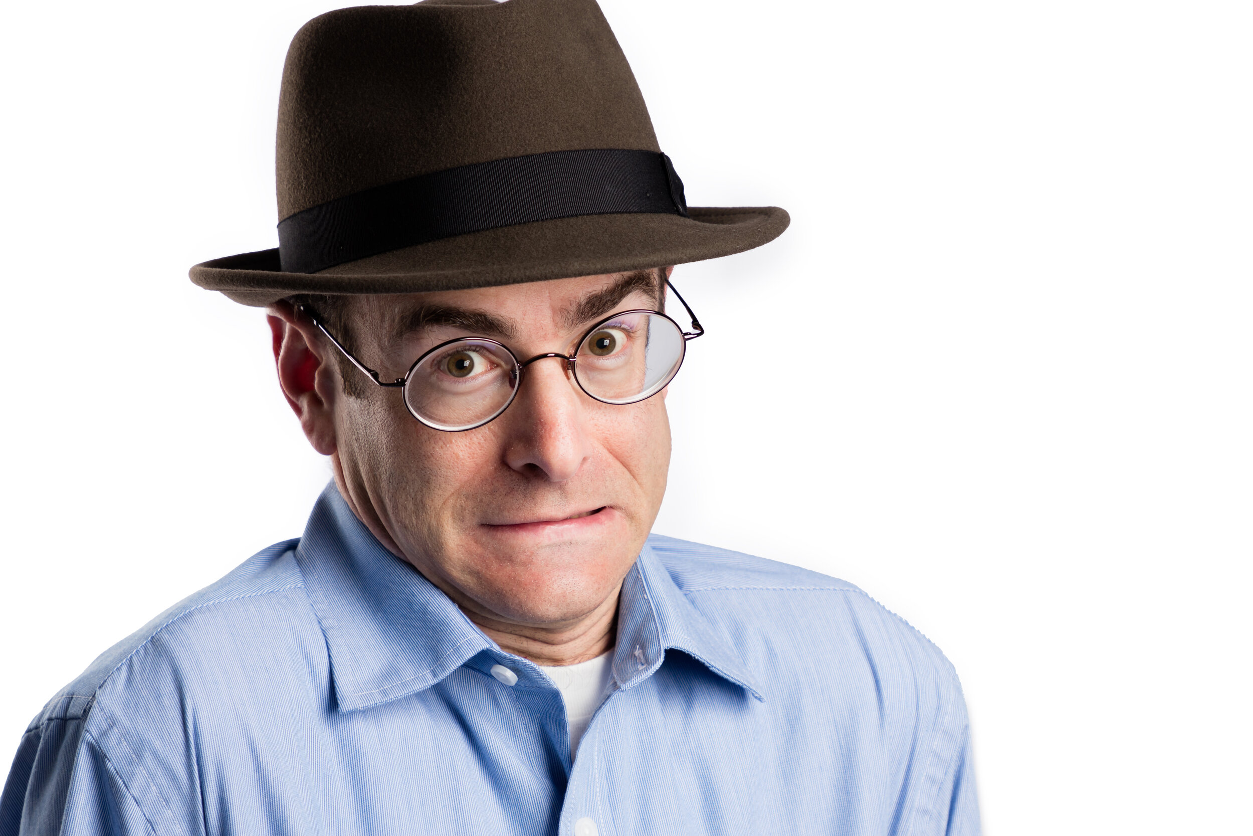
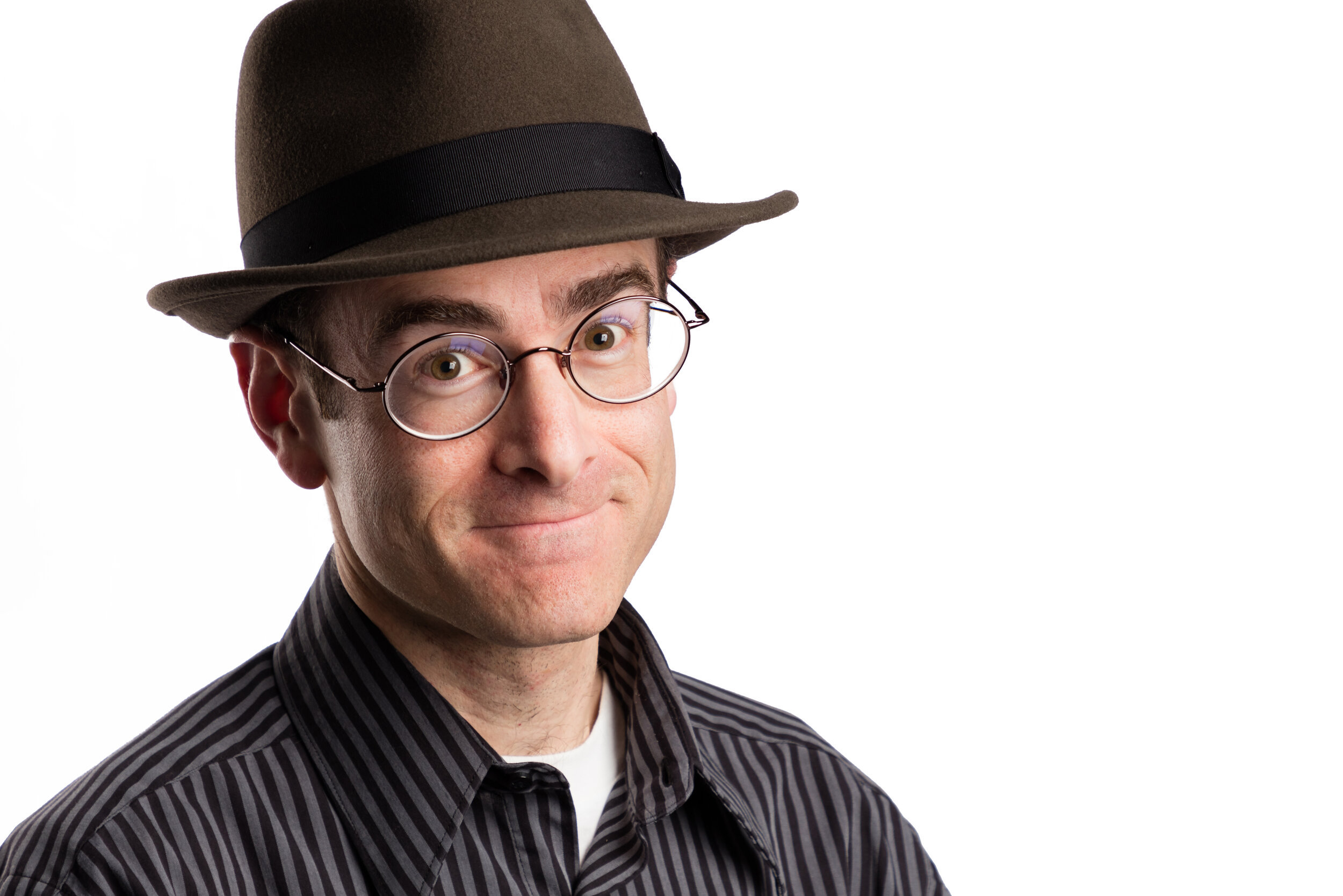
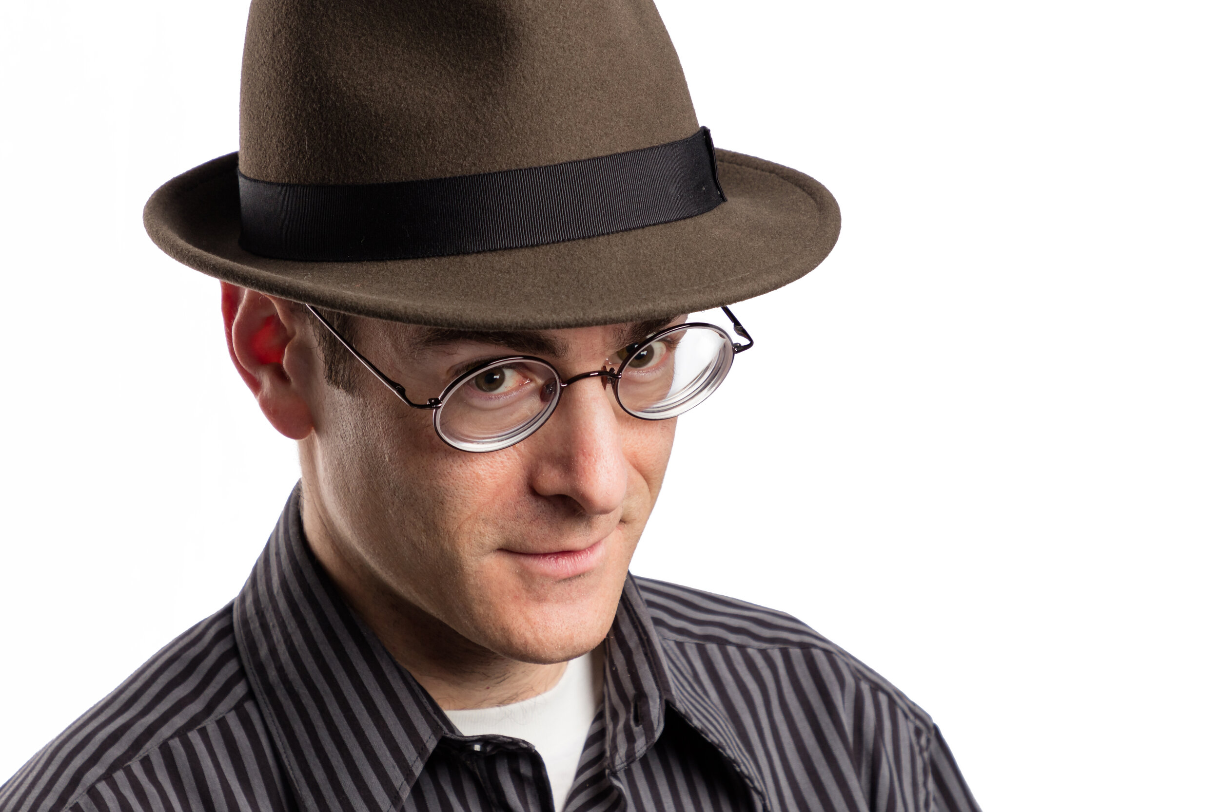
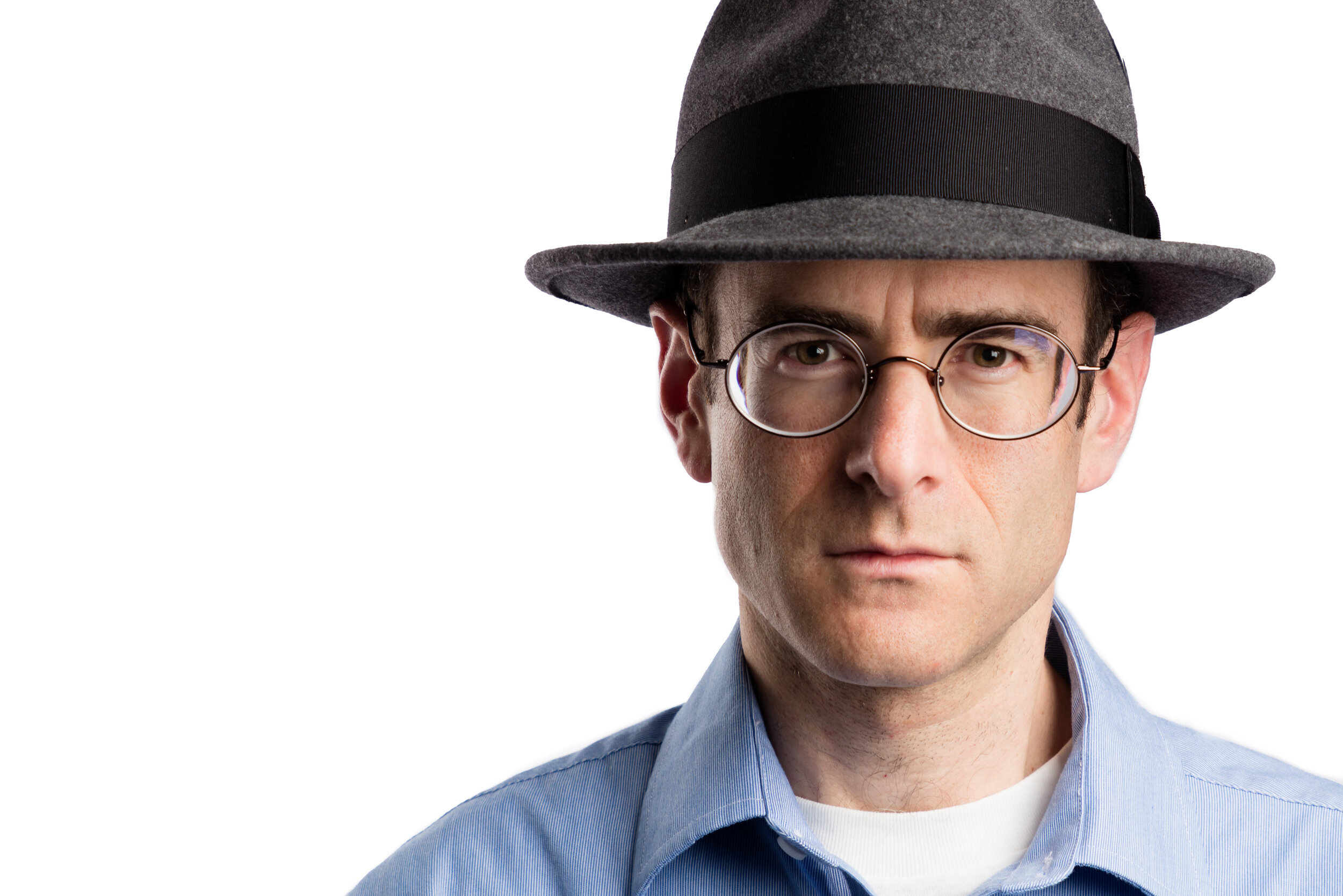
I’m an architectural photographer, not a headshot or portrait photographer.

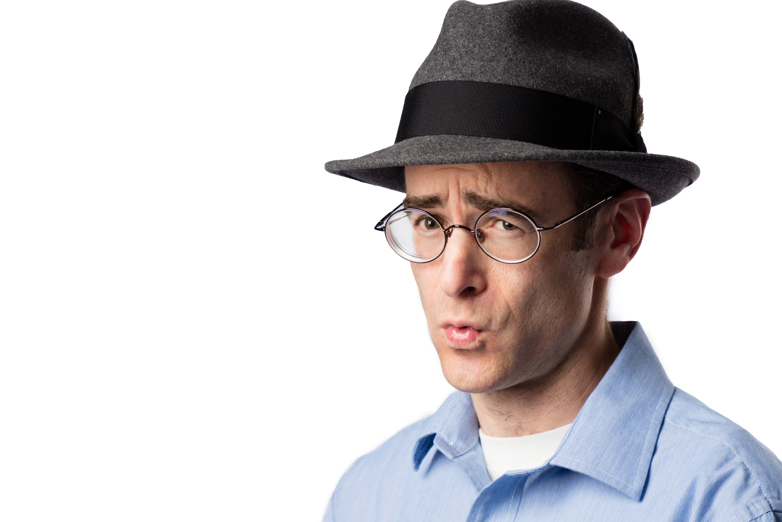
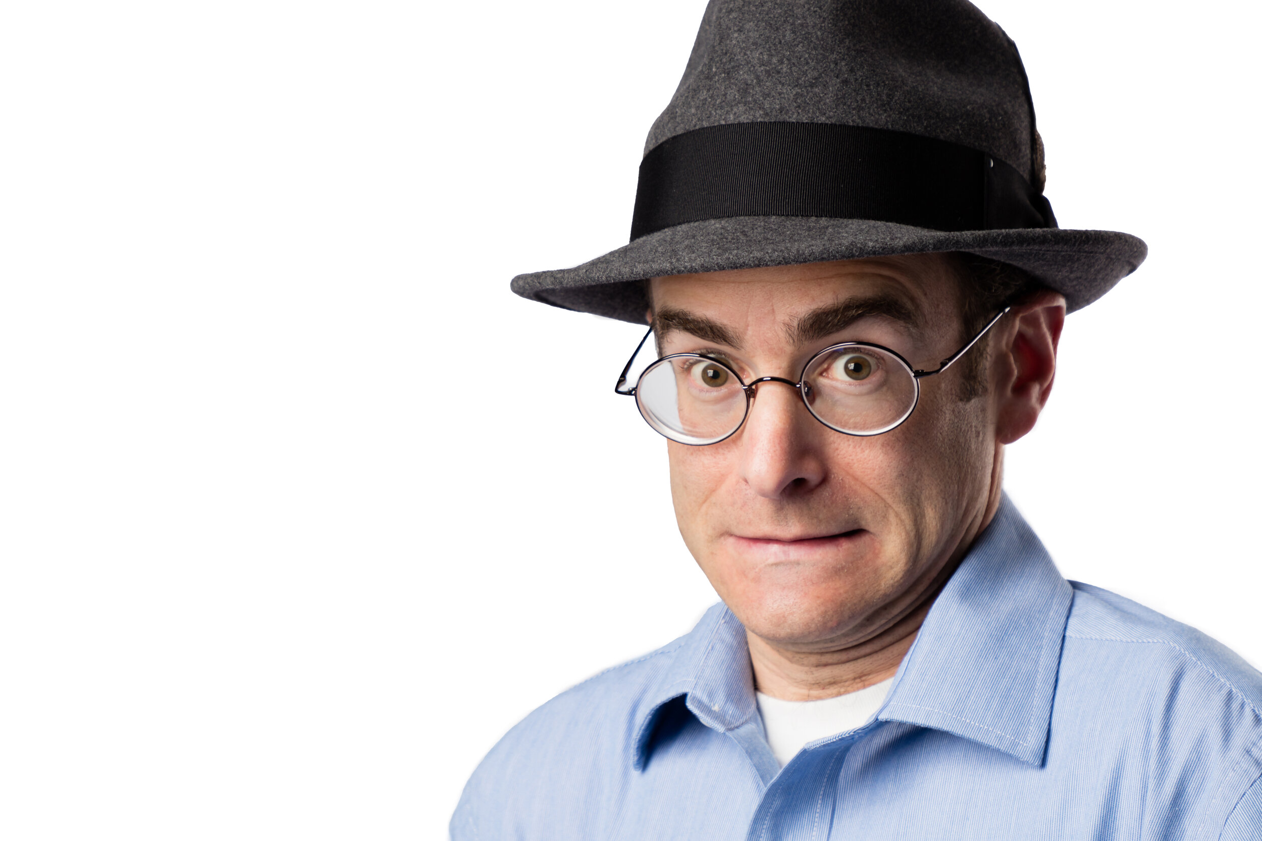
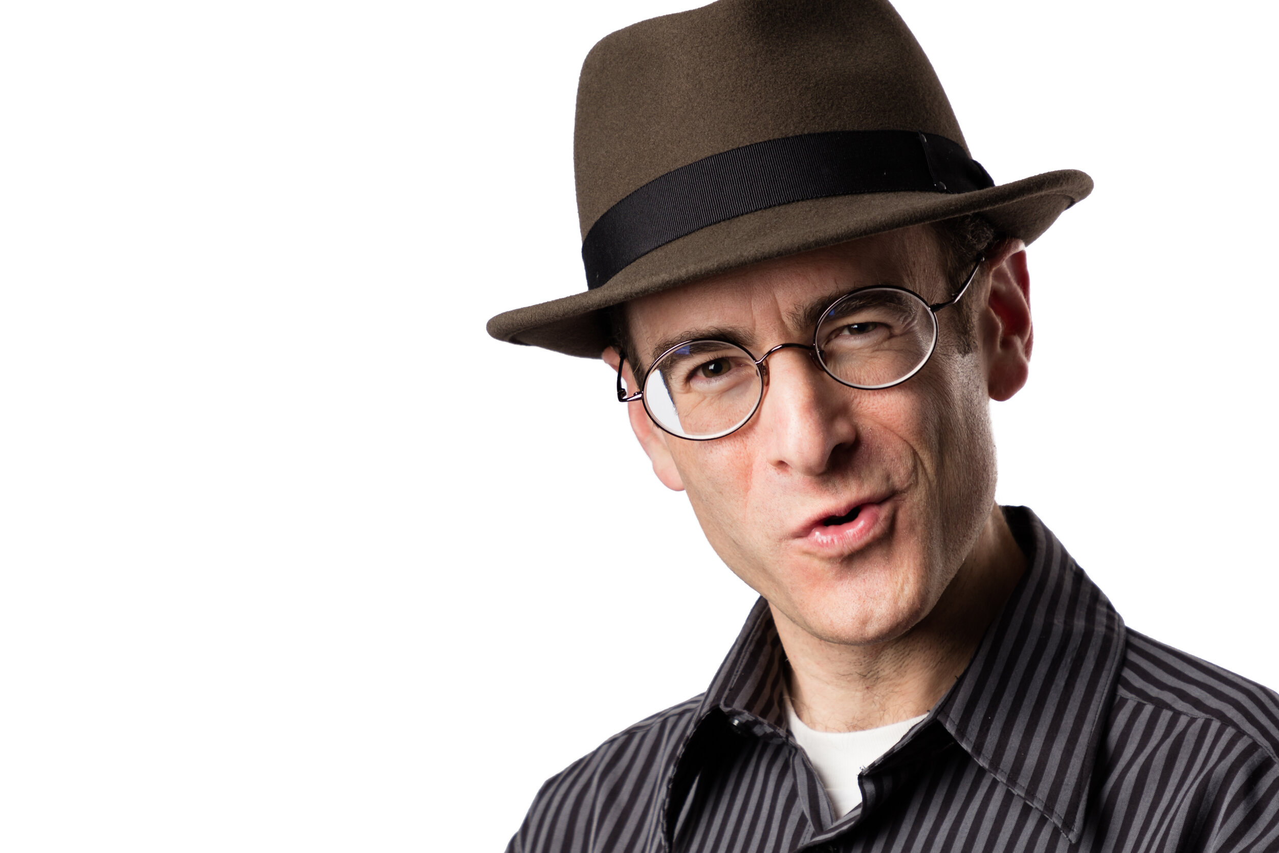
But it’s time for a new headshot, and with the current health crisis causing an extended pause in my architectural projects, I decided to produce a new headshot for myself as a personal project. No, this photograph is not the final result!

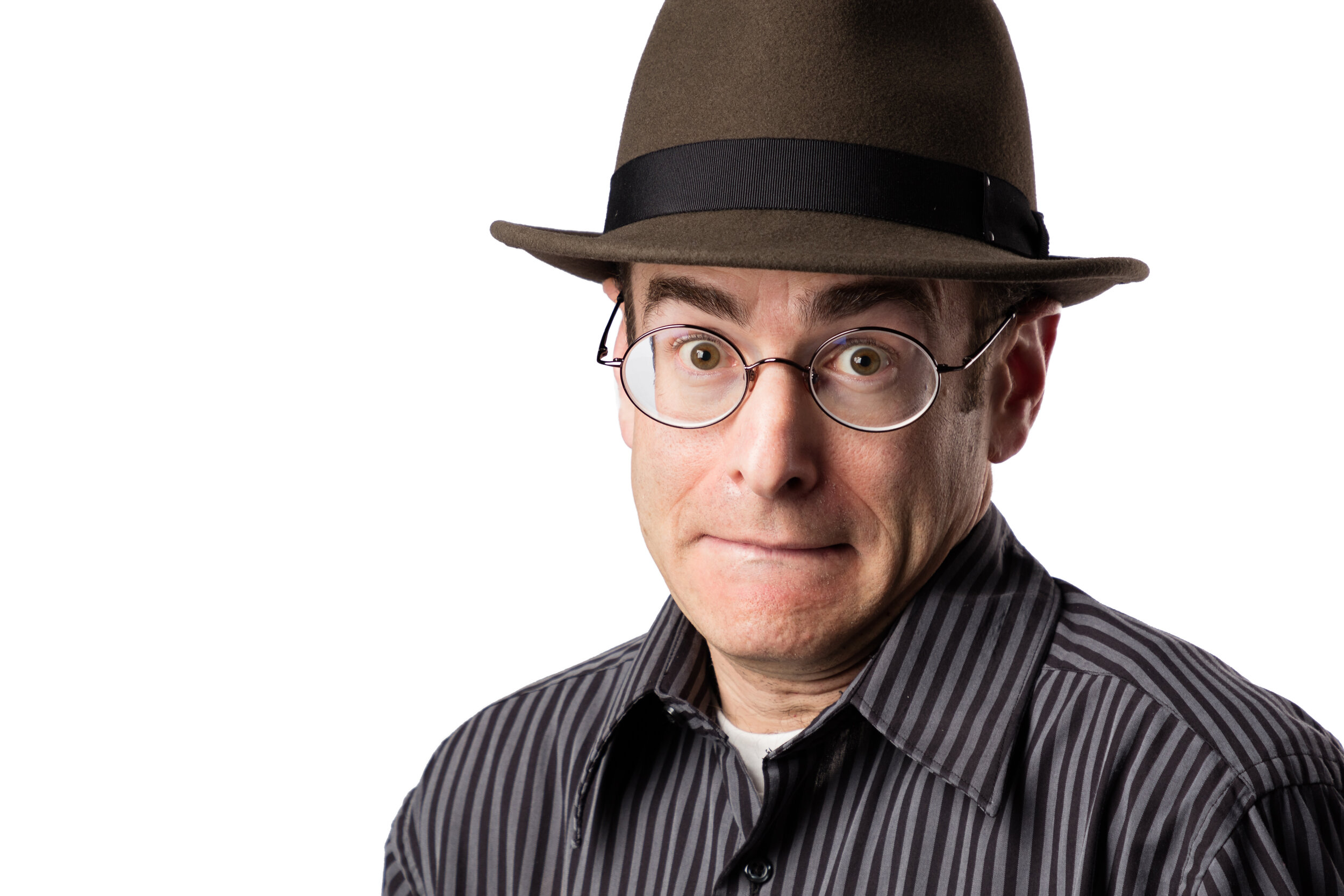
2 - Headshot 2020 - Michael Tessler.jpg
 

My old headshot is a few years old, and it’s time for a refresh. I have lights, a camera and tripod, a lens that would work well for portraits and headshots, the ability to control the camera remotely--including focusing--and some extra time on my hands, so why not take a shot at doing it myself? I even have a plain white background, which I occasionally use to photograph custom-designed furniture, and which also makes a perfect backdrop for a headshot.

I’m not a generalist. I see very strong value in specializing in one type of photography. For me, that’s architectural photography. The idea of working in other genres is daunting to me, and I’m most interested professionally in sticking with photographing architecture and design. It’s what I love, and it’s what I’m best at doing.

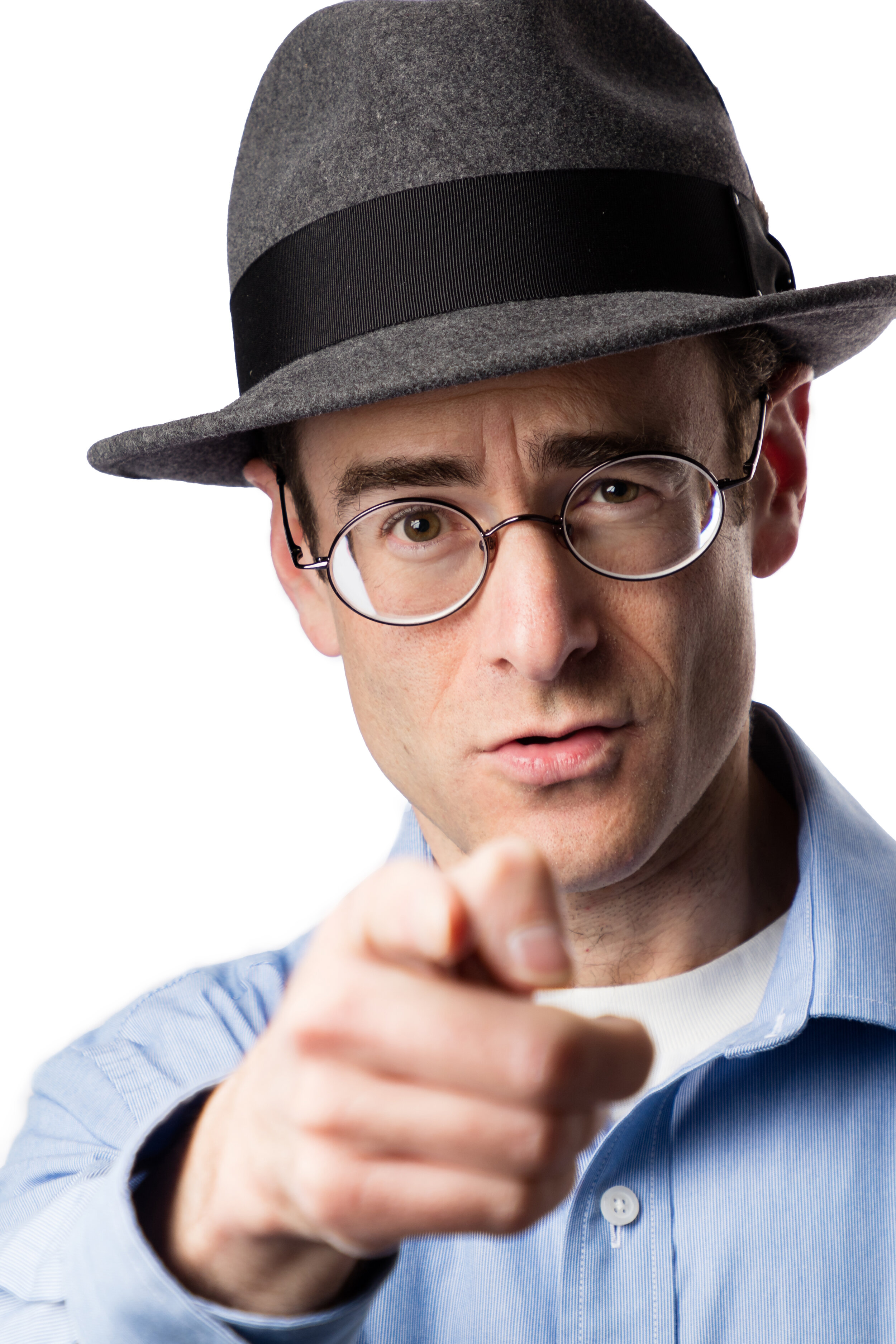
I want YOU for a new headshot!

I want YOU for a new headshot!

But like I said, I have all the necessary equipment and I have the technical knowledge to make a portrait or headshot, so I went for it. What I don’t have is the non-technical knowledge and experience a real headshot photographer has, and just like in architectural photography, that’s actually far more important than the technical aspects of headshot photography. For example, I don’t have experience in directing my subject, posing them, and pulling a great expression from them. These are some of the most important skills that make or break a headshot photographer. Even if I had that experience, I’m not sure how much it would be worth given that I am the subject--it’s a self-portrait! But I’ve studied headshot photography out of a general interest in other types of photography, so I have some idea of what to do.


The key for me is to capture a photograph that looks like me. I know that sounds ridiculous. It’s a photograph--of course it looks like me. But I mean, I want a headshot that looks like me. I think of it like this. I can walk into a room, pull out my phone, and snap a shot of the space. Does it look like the room? Of course. But it does nothing to bring out the meaning of the space and the highlights of the architecture and design. It doesn’t tell a story. It doesn’t flatter the design and the space. For that higher level of communication through photography, I need to approach the photograph as an architectural photographer, not just someone taking a random snapshot of the room.

I mean the same thing here. Not just any image of myself is going to do. I need to capture myself looking genuine, real, and expressing something about myself that is authentic. A staged portrait where I’m looking at the camera and saying “cheese” is not going to be good enough.


So how did I approach this project? I tried a lot of different things. I mixed in a lot of goofy faces to keep myself loose and natural. I thought of something that made me laugh--really genuinely laugh out loud--and then I captured images around that time. These are the ways I tried to extract a genuine and natural expression from myself rather than a staged, forced smile.

I made close to 400 images of myself, but this  was not just a matter of “spray and pray.” In each image I tried something different. I set the lights up one way or another. I wore different clothes. I turned one way or another to the camera. And I worked on a number of different expressions and ideas as I described above.

At the end of the day I narrowed those 400 images down to 20. I stepped away from it for a few days and took another look at the candidates. I eliminated 8 more and then presented the final 12 to some friends who have a lot of experience evaluating headshots. After getting their feedback and discussing the final options, we all agreed on three final candidates.

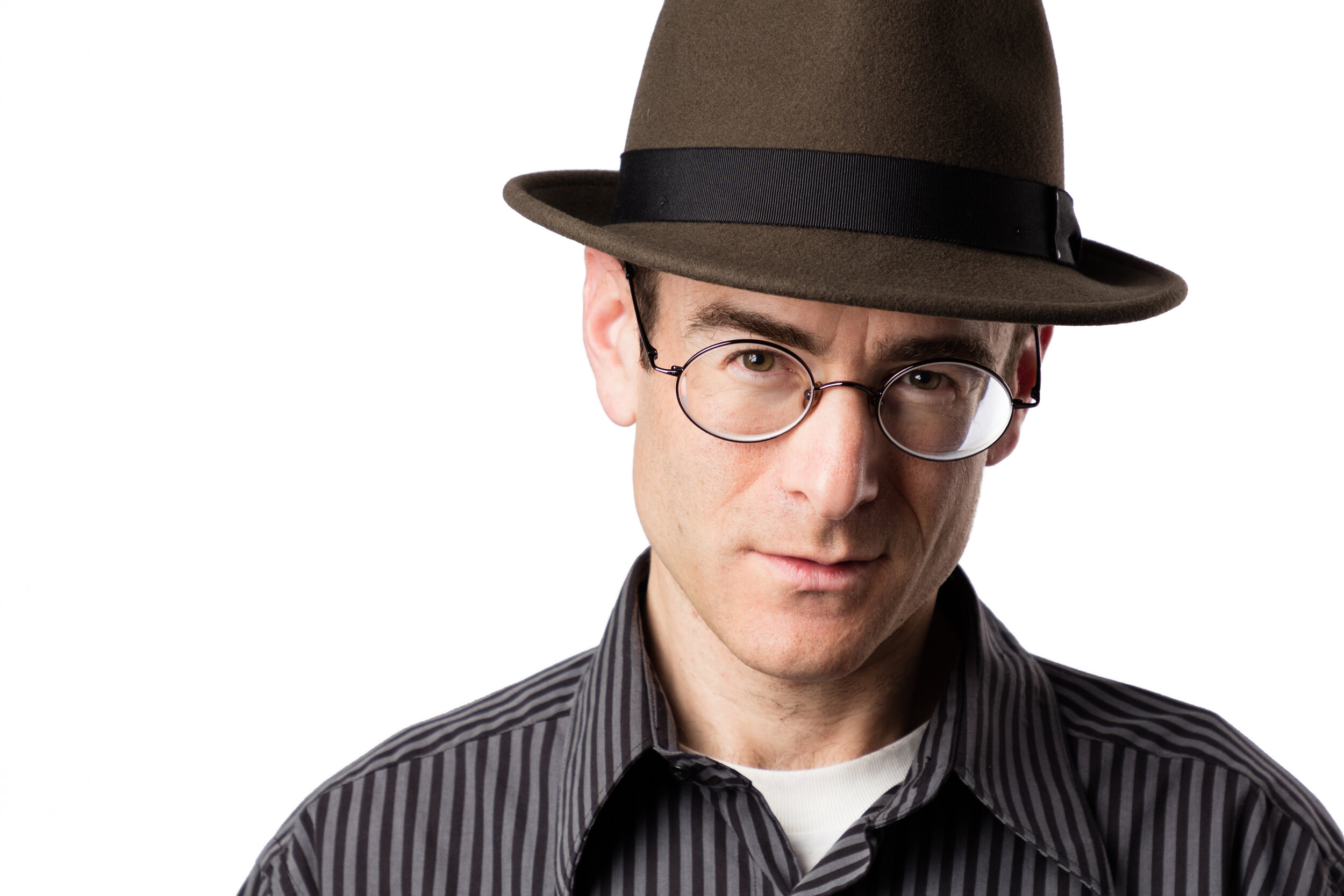
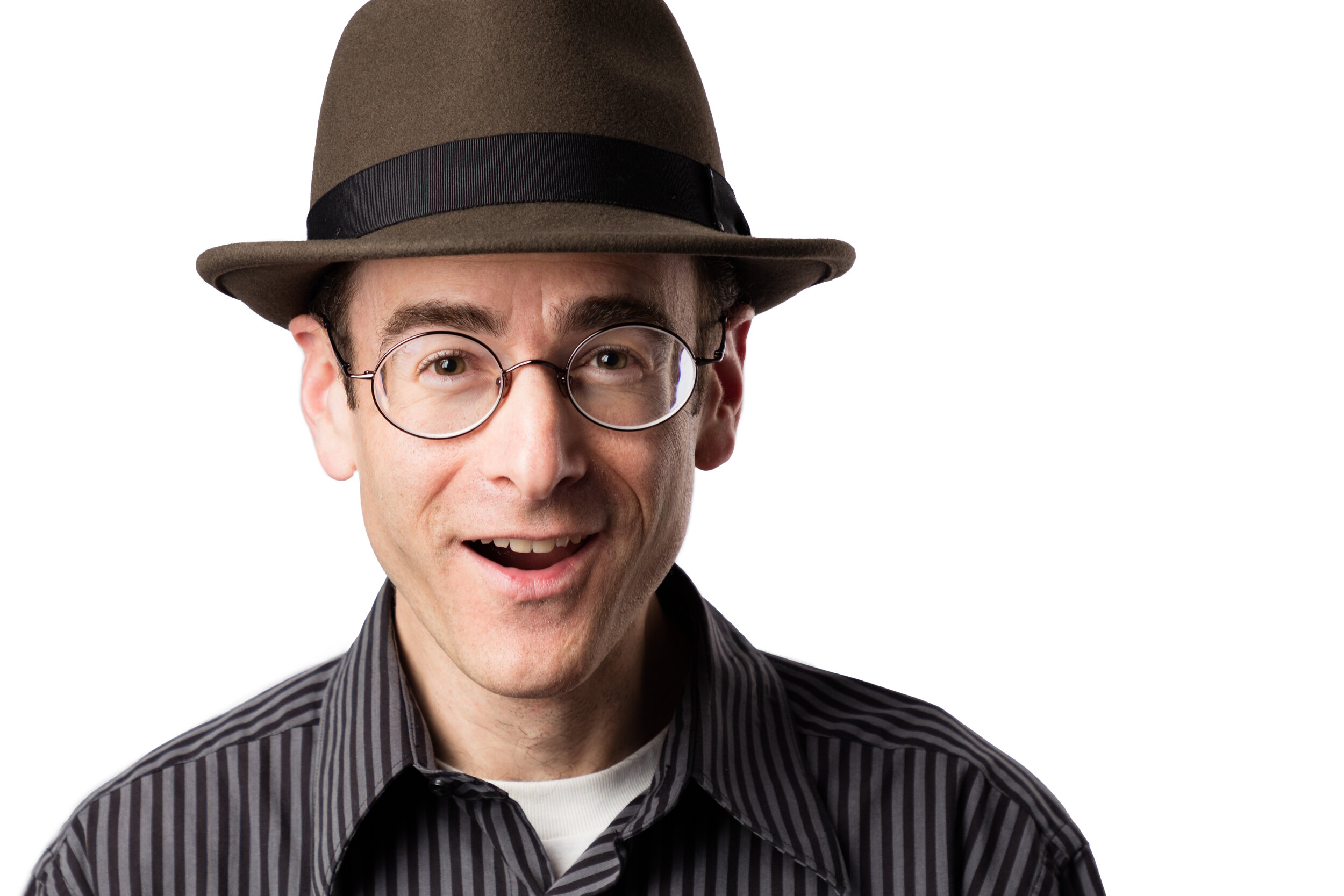
These three photographs truly represent me. They look like me, and they each say something about me that is real, true, and comes across genuinely. I will now be using these headshots for different purposes. I’ve shared above some additional favorites from this project, but these three are my official headshots. You can see two of them in action on my About and Contact pages and right here in the sidebar of my blog.

Is this something I want to add to my repertoire? No--I’m an architectural photographer, and that’s what I want to be. But it was actually a lot of fun setting everything up, doing the photography, and doing the retouching on these photographs. It gave me a much greater appreciation for what a true professional headshot photographer does.

All genres of photography are deceptively simple. You might think there’s nothing to it, especially these days with all the great gear. But the more you know and understand about photographing different types of subjects, the more you realize how much actually goes into the highest level of photography in each genre--and how little any of that has to do with the gear. There is just so much to know and learn, and every type of photography is different and has its own challenges and required knowledge and experience. Only by specializing and devoting a career to one genre can you become a true master of that field of photography. That’s what I continue to strive for in architectural photography. For now, though, I hope you like my new headshots!

The Steel Building

Architecture is often part of a company’s branding, and in the case of Pittsburgh’s tallest building, that was the original intent.

UPMC Tower, Pittsburgh, PA

The US Steel Building (now the UPMC Building) was built by the US Steel Company in 1970 and dedicated in 1971. It is 64 stories (841 feet) tall and was designed by architecture firm Harrison & Abramovitz [1].

Before continuing, let’s get the names straight. Originally, the skyscraper was called the US Steel Building, and that’s how I’m going to refer to it. Its name was changed to USX Tower in the 1980s. In the early 2000s it was changed to US Steel Tower. The building is currently known as the UPMC Building.

With all that name changing, the building has seemingly changed identities often, but to me it remains the US Steel Building. It is a three-sided triangular building having an indentation at each corner. Its triangular shape matches the shape of downtown Pittsburgh--think of the Point where the three rivers meet. For over 30 years, the top floor was home to the Top of the Triangle, a restaurant that was the highest restaurant in Pittsburgh until it was closed in 2001.

When driving or walking by the tower, you immediately notice one of its prominent features--the exterior steel columns supporting the structure. When I see those structural elements, I think of the strength of steel, and it reminds me why this building’s design was appropriate for the US Steel Company. The entire building appears to be a testament to the strength of steel, and indeed it was meant to be a symbol of the strength of the steel company housed inside.

Detail of the UPMC Tower, Pittsburgh, PA

The 18 steel columns were made from US Steel’s new product at the time, Cor-ten steel, and the building was intended by US Steel to be essentially a huge demonstration of the product. Cor-ten steel is now a common construction material, and one of its features is the way it weathers. The surface of Cor-ten oxidizes in the weather and forms a dark brown coating over the steel. The coating protects the steel from deeper weathering and eliminates the need for cleaning, painting, or other means of preventing rust [2].

UPMC Tower, Pittsburgh, PA

Main entrance to UPMC Tower, Pittsburgh, PA

The largest tenant currently in the Steel Building is the University of Pittsburgh Medical Center (UPMC). As a result, the building is currently called the UPMC Building--and huge signs at the top of the building declare that title--but the US Steel Building remains a symbol of Pittsburgh’s steel town past. As the city’s tallest building, it serves as a reminder of where the city came from. May its strength and endurance guide Pittsburgh into its future as well.

Sources

1 https://pittsburgh.cbslocal.com/top-lists/u-s-steel-tower-visitors-guide/

2 http://www.fieldtripper.com/c/UVDCp-bPkLA/u-s-steel-tower

Updated Website!

I’m excited to announce the launching of my updated website!

Lou Ruvo Center for Brain Research by Frank Gehry, Las Vegas, NV

I recently updated my website to change the layout and apply a new template. It was a lot of work, but it was worth it. I use Squarespace for my website hosting, and their tools are really excellent. They make it very easy to get a site up and running, and they offer a lot of customization within their templates.

But it can be a tedious process when you’re trying to accomplish some very specific, nit-picking kinds of changes. No template is perfect, but with a few customizations I was able to get my website looking and working exactly the way I want.

The plaza at PPG Place, Pittsburgh, PA

I’m now using a template that is very common among photographers. At first I was hesitant to make this change because it’s so common. But I realized that my first website on Squarespace when I originally started my business used this exact template. I only later moved away from it because I wanted some additional features it did not offer. But there was a reason I chose it originally, and there is a reason I came back to it now. It’s probably the same reason that so many other photographers choose it. In my opinion it is the best presentation of photography.

It presents the images in as large a format as possible without any wasted space while still maintaining the proper aspect ratio of each image. It responds perfectly to changes in browser size or screen size. I tried several other templates, and even with a lot of style tweaks and custom CSS injection, it was nearly impossible to get them to work the way I wanted as flawlessly as my new template works right out of the box.

I wanted my website to focus on my work--after all, that’s the whole point of the website. And it is the work that differentiates my website from everyone else’s, even if some of them use the same template. Our work is all different. This website template puts the work front and center with no distractions. In the end, the template doesn’t matter--it’s the work you want to see. I think my website does a great job of presenting it to you. I hope you enjoy it!

The clubhouse at Tanager Apartments in Summerlin, Las Vegas, NV

A Matter of Perspective

Perspective matters, especially in photography.

Two Summerlin office building in Las Vegas, NV

Two Summerlin office building in Las Vegas, NV

When I photographed Two Summerlin, an office building in Downtown Summerlin in the suburbs of Las Vegas, NV, one of the primary views was to capture the west-facing facade of the building.

A parking garage across the street provided some options for this composition, but my scouting indicated that photographing from the roof was too high a perspective. A street level photograph from that general direction also wouldn’t work because of the road and the center median of palm trees which prevented a clear view of the building. I often prefer a lower perspective for exteriors, but the obstructions ruled out that perspective.

My scouting clearly indicated that the best location was from the second or third story of the garage. Unfortunately, awnings block the view from the garage on those floors, so that perspective would be impossible.

Impossible, that is, unless you hire a scissor lift! And that’s exactly what we did. We set up the lift on the sidewalk in front of the garage and I had it raise me to just the right height. I had the operator fine-tune the position of the lift so that the trees were where I wanted them. I wanted certain parts of the building to be completely visible while I was OK with the trees covering other parts of the building. A little higher and the perspective became too flat. A little lower and the trees were too high and too much of a distraction in front of the building. A little to the left, and the trees started to cut off the left corner of the building, which I wanted to be unobscured. And a little to the right and the balcony area became covered with the trees. We made some fine adjustments until I was satisfied with the perspective.

Maybe you’re thinking, why not just use a drone? Well, I don’t do drone photography. Not yet, at least--it is on my radar for the near future. In this case, though, we wanted a twilight photograph, and the lighting and other requirements would have made using a drone very difficult for this view. So we opted for the scissor lift.

The timing of the shoot made scheduling the lift very difficult, and it ended up taking several weeks to get it scheduled. As time passed I became worried that I would not be able to complete the photograph before it was needed. So as a backup plan, I made a photograph from the roof of the garage, the location which my scouting indicated was too high. But I wanted to have something in case we could not schedule the scissor lift in time. Although I was pleased with the way the photograph turned out from a technical standpoint, and although I had invested a significant amount of time in the production and post-production of the image, it was clear that this was simply not the best perspective. It was too high. Here are the two photographs side by side for comparison.


This perspective from the roof of the garage across the street is too high.

This is the final image from a lower height taken from the scissor lift.


The higher perspective has several problems. First, we are able to see the equipment enclosure on the roof, which is not meant to be seen by a normal observer from the ground. Next, the eyebrow shade extension above the top floor--one of the architectural elements the architect wanted to capture--is completely lost because we are photographing from the same height as that element. Finally, the building just looks flattened and not very impressive. All of these problems are corrected by choosing the lower perspective.

Choosing the proper perspective is one of the most important keys to good architectural photography because as can be seen here, perspective dramatically affects the look of the final image. Getting the right perspective on location is even more important when you consider that perspective cannot be changed in post-production. I can do almost anything in post, but changing perspective is not possible. Yes, there are tools in Photoshop to alter perspective, but they really just push pixels around and use various types of distortion to simulate a different perspective. The eyebrow on Two Summerlin is the perfect example of why perspective manipulation in post-production cannot truly change the perspective. In the image from the roof, the pixels that would record the eyebrow do not exist. No amount of skewing or perspective warping is going to bring them back.

And that’s why I take my time when selecting my compositions and preparing to photograph an interior or an exterior. I evaluate the options, and I fine-tune the composition and the perspective. Once these are set, they cannot be changed in post-production, and in the end they will make or break the image.

If you’d like to read more about perspective, here’s a great article on Understanding Perspective in Photography.

Working With Models

When people find out I’m a photographer, sometimes I’ll get questions like, “Hey, do you shoot weddings?” No! Or “Maybe you could do our family portraits.” No! I photograph architecture, not people. You know, buildings, and that kind of thing. Objects that don’t move or have faces.

Holy Spirit Catholic Church, Las Vegas, NV

Holy Spirit Catholic Church, Las Vegas, NV

Well, sometimes I do photograph people. Like most architectural photographers, I love having people in my images. People bring life to an image. They can transform a space that would otherwise look dead into a living, bustling environment where the viewer can picture themselves and get a feel for what the space is really like.

World Market Center, Las Vegas, NV

World Market Center, Las Vegas, NV

Sometimes people add scale to an image. In this photograph from the World Market Center, you don’t realize just how big those buildings are until you notice the tiny people walking in the background. It feels like you’re walking through a huge cavern when you’re there among those three buildings. Without the people, the photograph would never convey that feeling.

Usually when I include people in my photographs, it’s unscripted and anonymous. If I’m in a space, I just try to capture people moving through it, or standing and talking on the phone or to someone else. The people are frequently motion blurred and almost always unrecognizable. That’s helpful because it removes the need to worry about model releases. If you’re in an area with no expectation of privacy, you are fair game. And if nobody would reasonably be able to identify who you are, then all the more reason no model release is needed.

But sometimes people play a more prominent role in the photograph. Maybe it’s more of a lifestyle shoot, or an advertising or marketing shoot where a company wants to project a certain image. Or it could just be a regular architectural shoot where you want to show spaces being used in specific ways. In these cases the people usually need to be positioned and directed.

Office remodel with glass-enclosed conference room, Las Vegas, NV

Office remodel with glass-enclosed conference room, Las Vegas, NV

Here’s an example from an office remodel I photographed for the architecture firm. I wanted to show the conference room being used as a conference room. I didn’t want it filled with people, but I thought a private meeting between two people would create a good scenario to help tell the story of the space. I had to decide where to have the people sit, and I had to get them to look natural and look like they were actually having a meeting in that room.

So, now the tough part begins. I photograph buildings, remember, not people. And I’m introverted, polite, and not the most assertive person when it comes to telling other people what to do. How am I going to direct these people and get them to do what I want? Especially when they’re not professional models or actors, like in this case. The three people in this photograph were volunteers from my client’s architecture firm. They may have felt as awkward about being posed in this scenario as I felt about directing them. Then again, they did volunteer for this. We’ll see if they come back the next time, I guess!

What I’ve found is directing the people who are just sitting having a conversation or something like that is pretty easy. I just tell them to have a normal conversation. Talk about the weather, if you want, I tell them. Anything. I just want them to behave naturally--to look at each other, smile, use normal hand gestures, etc.--all without having to think about it. If they have to think about it, it won’t be natural, especially since they are not actors or models. So I don’t tell them to look natural or to look at each other or to hold their hands a certain way. I just say, please talk to each other about something. Then I walk away and go about my business, trying to catch them at the right moment.

The harder part for me given my personality is directing the person walking down the hallway. Every time I do that I feel bad about it. How many times can I ask someone to walk down a hallway, or up and down a set of stairs--slower this time, now faster, now that speed but keep to the right more, etc.--before they’ve had enough! Usually it takes at least two or three takes to get it right, and it’s one of the hardest things I have to do. To say, “OK, could you do that again, but this time….” Ugh! I dislike that so much that I sometimes end up using myself for those kinds of situations. It’s so much easier to do it myself because I know what I’m looking for, and I don’t care how many times I have to do it to get it to look the way I want. Thank you, CamRanger and smartphone!

Working with people can be a challenge, but it’s also fun. Usually the people are good-natured and are having a good time too. But in the end, every time I work closely with people in my photographs, I’m reminded of one of the reasons I chose to photograph architecture!

The Play of Light and Shadow

One of the things I love to do in architectural photography is to observe how the movement of sunlight throughout the day affects a building’s appearance.

The light casts shadows with interesting helix patterns through the patio overhang.

The light falls on the building in different ways throughout the day, and these changes create dramatic differences in both the interior and exterior of the building. Sometimes it creates interesting patterns, like in this photograph from a recent project I completed at an office remodel in Las Vegas, NV.

The sunlight interacts with the patio structure and creates an interesting helix pattern in the shadows on the ground. It’s a beautiful effect. We anticipated something like this happening during the day, and while working on the interior photographs, we kept an eye on the light conditions on the patio so we could make this photograph at the right time.

I was impressed with the work my client did to transform this building. It was a blank slate to start with--literally just four walls and a roof. My client transformed the space into a beautiful office facility with workstations, offices, conference rooms, a kitchen area, and several places to sit and meet informally. Here are a few more photographs from the project.

The long table is in the dining area, and behind it is a sitting area. Behind that is the reception desk.

Two sofas and a coffee table provide an area to relax while waiting for a meeting.

Here you can see the two separate levels in the office. The conference rooms are on the mezzanine level, and the workstations and offices are on the first level.


Savidan Gallery Exhibition

I am honored to announce the opening of my first gallery exhibition at Savidan Gallery located at Faciliteq’s showroom in downtown Las Vegas, NV. I’m really excited about this opportunity to share some of my work with the larger design community in Las Vegas.

My exhibition features photographs of the architecture and design of downtown Las Vegas, but it’s not what you might think. I don’t have photographs of the casinos or Fremont Street on display. Instead, these are photographs that show Las Vegas as a living, working city.

For example, featured among my photographs are the Las Vegas City Hall, the World Market Center, the Smith Center, and several residential and commercial buildings. These are the structures of government, culture, life, and work that make Las Vegas a real city beyond its facade of casinos and entertainment.

Inside the Savidan Gallery at Faciliteq on 3rd Street in Las Vegas, NV

This work is part of my ongoing project to capture the environment and life of downtown Las Vegas.

Inside the Savidan Gallery at Faciliteq on 3rd Street in Las Vegas, NV

At the opening reception last night, I said I wanted to thank the architects and designers who continue to build Las Vegas because without them, none of my work would be possible. Not only do architects and designers create the subject matter I love to photograph, they also serve as my inspiration.

I tried to make my photographs fit right in with the scenery outside.

If you’re in Las Vegas, stop by Faciliteq’s showroom on 3rd Street. They have a beautiful gallery, and I’m proud and honored to be showing my work in it.

Savidan Gallery at Faciliteq, Las Vegas, NV

New Instagram Account

Wow, it’s been a long time since I’ve posted a new blog article, but that is not because I haven’t had anything going on! In fact, I’ve been extremely busy with a lot of different projects. I’ve also been working very hard to connect with architects and designers and others who are interested in professional architectural photography.

I have also been working on my Instagram account. Over the past few weeks, I have been making a great effort to increase my activity and presence on Instagram. I am trying to make a new post to my account each week. I’m going to continue to post my finished architectural photographs on Instagram, but I also plan to do some behind the scenes posts. I’m working on a video right now that will show some of the magic of post-production in Photoshop.

Here is one of my latest posts:

500 S. Main Garage, Las Vegas, NV

You can learn a little more about this building--parking structure in downtown Las Vegas, NV--in my post. My Instagram account is @michaeltessler, and I added an link to my profile here on my website in the upper right corner of each page.

I am finding that Instagram is a great way for me to connect with lots of different people who have an interest in architecture and design. I hope to see you out there!

Post-Production: Fixing Major Issues

Architectural photographs should be clean, simple, and graphic. They should tell a story clearly and without distraction. They should focus on the architecture--the shape, pattern, line, and design of the space. Any element that does not contribute to the story of the photograph detracts from it. That’s why I almost always remove unnecessary, non-architectural elements like light switches, outlets, and air vents from architectural images. These changes are a normal part of post-production and are relatively straightforward to accomplish. Sometimes, however, more difficult situations arise. I’d like to share two examples from one of my recent projects.

The new HealthCare Partners facility in Pahrump, NV features a rock sculpture with light display. Designed by Daniel Amster, Dakem & Associates, LLC.

HealthCare Partners is opening a new 57,000 square foot medical center in Pahrump, NV. The building was designed by Daniel Amster of Dakem & Associates, LLC. The photograph above shows the exterior of the structure, which includes a large rock sculpture with a multi-colored light display. The photograph below shows an interior view of the main hallway of the building.

Main hallway of HealthCare Partners in Pahrump, NV. Designed by Daniel Amster, Dakem & Associates, LLC.

Look at the back wall on the right side of the photograph. That’s not how the wall looked when I was there. Here’s one of the raw images before post-production. There were several palettes with lots of large boxes up against the wall. Unfortunately it was impossible to move the boxes out of the way. I needed a photograph from this perspective, though, and I was able to fix this issue in post-production.

Note the boxes against the wall on the right.

I knew it would be possible to remove the boxes in post-production because they were sitting in front of a blank wall. That's easy enough to replace. The hard part about this fix was recreating the light and shadow on the wall. There is a diagonal shadow and an intersecting hot spot from an overhead light, and I had to reproduce the subtle changes in light and shadow accurately so the fix would be convincing. This fix was time consuming and required some Photoshop skills, but it was necessary and well worth it. The otherwise acceptable photograph would be unusable without this fix.

HealthCare Partners main entry, Pahrump, NV. Designed by Daniel Amster, Dakem & Associates, LLC.

Returning to the exterior, here's a view (above) of the main entry of the building. I made one major change to this photograph to prepare the final image. The column on the left has a heavy garbage can in front of it. It was too heavy to move any distance, and I did not have a dolly to get under it, so I had to photograph with it in the frame. It could not remain in the final image, however.

Note the garbage can in front of the left column.

The fix for this situation was more difficult because I actually had to reconstruct the column. I paid a lot of attention to matching the color and lighting of the column. If you didn’t know I had done anything there, I don’t think you would be able to tell that anything has changed, and that is always my goal with these kinds of fixes.

Rescuing photographs from problems that could not be fixed on location is an important part of post-production in architectural photography. It’s not easy, and it is always much better to fix things on location when possible, but I love doing it. I’m always amazed at what can be done with Photoshop given enough time, experience, and attention to detail.

Geodesic Dome House, Palm Springs, CA

One of my most recent projects brought me to a unique home in a spectacular location. This house is in Palm Springs, CA. The house features a geodesic dome invented by Buckminster Fuller and is sited in the large wind farm at the north end of Palm Springs.

Geodesic dome house in Palm Springs, CA. Re-designed by California architect Pavlina Williams, AIA.

This house has an interesting history. It was originally built in the 1950s as a weekend family vacation home for a chemical engineer from Torrance, CA. The house was built without an architect and was pieced together by neighbors and local residents.

Palm Springs, CA. Architect: Pavlina Williams, AIA.

Palm Springs, CA. Architect: Pavlina Williams, AIA.

Palm Springs, CA. Architect: Pavlina Williams, AIA.

In the 1970s, the owner bought a commercially available kit to add the geodesic dome. The primary dome of the house originally had very few windows, which is surprising considering the broad mountain views available at the site. The house remained unchanged until only a few years ago, when California architect Pavlina Williams, AIA and her husband discovered the house and recognized it as a diamond in the rough.

Palm Springs, CA. Architect: Pavlina Williams, AIA.

Palm Springs, CA. Architect: Pavlina Williams, AIA.

Pavlina redesigned the dome, adding the triangular and other geometric windows which now provide panoramic views of the area. She completely renovated and remodeled the interior as well, introducing a treasure of mid-century modern furniture and design.

Palm Springs, CA. Architect: Pavlina Williams, AIA.

Palm Springs, CA. Architect: Pavlina Williams, AIA.

The house is now the perfect desert retreat, and it’s a great place to escape for a weekend. Thanks to the efforts of Pavlina, the house has become an architectural gem in the desert.

Geodesic dome house in Palm Springs, CA. Architect: Pavlina Williams, AIA.